Learn how to build and publish design systems effectively. Discover best practices for creating reusable components and enhancing UI consistency.
This blogpost is a part of the "Building Design System and Micro Frontends" series. For more content, read the first post. The source code for all parts of this series can be found in this GitHub repository.
React
Proven, stable, excellent component composition system, focus on back-compatibility. Read the "Design Principles" post on reacts blog; this post outlines react development guiding principles.
Tailwind
Gives us a simple way to define seed for the design system. Sizes/Distances scale, colour palettes, shadows, responsive breakpoints, transitions and animations etc., all can be defined succinctly. It also gives us ultimate style isolation and a big productivity boost.
Storybook
Helps us develop components in isolation. Helps in component testing and, when exported, delivers portable documentation.
Webpack
Proven, stable, vivid plugin ecosystem; a lot of materials.
Setting up a Design System Project
Create directory design-system and run the following commands from it:
npm init -y will setup package.json file.
Run npm run storybook to build and run storybook. It should bind to port 6006. Open http://localhost:6006. You should see some example stories.
The npx sb init command takes care of setting up the storybook. It will create a stories directory with examples in the project root directory. You can remove its content. We will create a simple story later from scratch.
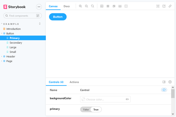
Run npm run storybook. Open http://localhost:6006. You should see something like this:
Building Design System Package
It is time to create production build of our design system. It should contain only necessary code. We will exclude react from the build. The assumption here is that whoever is consuming design system will be responsible for including react.
In a real project design system should be packaged and published to a npm repository so the other project can use npm to get it. However, for this walkthrough, we will build it and keep it in a directory on the disk. Other projects that we build in the next post will consume it from the disk.
Create an entry point for our library; Create ./src/index.js and add the following content:
import './styles.css'
import Button from "./components/Button";

export
Every component in our design system must be imported and re-exported in this file.
We use cookies to personalize content and ads, provide social media features, and analyze traffic to our website. We also share information about your use of our website with our social media, advertising and analytics partners. Our partners may combine this information with other data that you have provided to them or that they have collected as part of your use of the Services. This may include processing your data in the United States.
For more information about cookies, please see our privacy notice